Nooch Vegan Market
Overview
Nooch Vegan Market is a specialty grocery store located in Denver, Colorado. They sell 100% vegan products, from snacks, grab and go, body care, accessories, and more.
Problem
Nooch’s website doesn’t display its products or any events. The challenge was to improve their information architecture as well as the user interface design. Through research, it was possible to build their target audience and redesign the website’s user flow.
Solution
Re-design the home page and other key pages to better improve the user experience.
Research
Research was the first step to gather data on Nooch’s potential and current consumers. I was able to interview four people for an in-depth interview, and the response I got was enlightening. After gathering all the information from my research, I noticed that most vegans were not only looking for a grocery store, but a sense of community. Dietary restriction folks, on the other hand, wanted one less thing to worry about since most of them can’t consume any dairy products or are allergic to other ingredients, like gluten. Some of the main quotes extracted from this research were:
“I would love to know more about vegan events since I don’t have any vegan friends. It would be nice to have a direct source of what’s going on in the vegan community.”
— J. A
“I want to be able to shop without worrying about dairy products and have a normal shopping experience. My biggest priorities are consuming products that are dairy and gluten-free.”
— T. S
“I hate when websites only have certain diets. I want to be able to filter out my dietary restrictions. I don’t want to be grouped into a category I am not in.”
— M. M
Based on all the data I collected, it was possible to build Nooch’s two target audiences. Even though I was confident in the personas I had, I decided it was important to extend my research and visit the actual market. I thought it was crucial to visit Nooch and get a feel for how the store looks, what products they sell, meet their customers, and get their employees’ feedback.
In-Store Interview
I was able to briefly talk with one of Nooch’s employees and she said, “We have a lot of people come in that live around the neighborhood”. I was so intrigued by her response, so I asked if they had some customers with dietary restrictions that visit the store, to which she responded yes. She also said:
Through this research, I was able to understand Nooch’s current customers better. The data showed that people visited the store for convenience and because they are vegan or allergic to certain foods. Also, the market has a large amount of potential new customers that are looking for dietary restriction products (like gluten-free) and also want to be part of the vegan community. The strategy moving forward is to be able to meet all of Nooch’s consumer’s needs on their website.
Personas
After all the research, it was possible to create two personas.
Luisa follows a vegan lifestyle and enjoys the shopping experience at Nooch since she doesn’t have to worry about what she can or can’t eat. She is also looking to be part of the vegan community and would like to attend more events. See the full persona here.
Shae recently discovered that she is celiac and allergic to dairy. She is looking for a grocery store that will help her easily find the products she needs without having to look at so many labels. Shae is not vegan, but she enjoys all the vegan products, and she is always looking for a less stressful shopping experience. See the full persona here.
Sketches and Wireframes
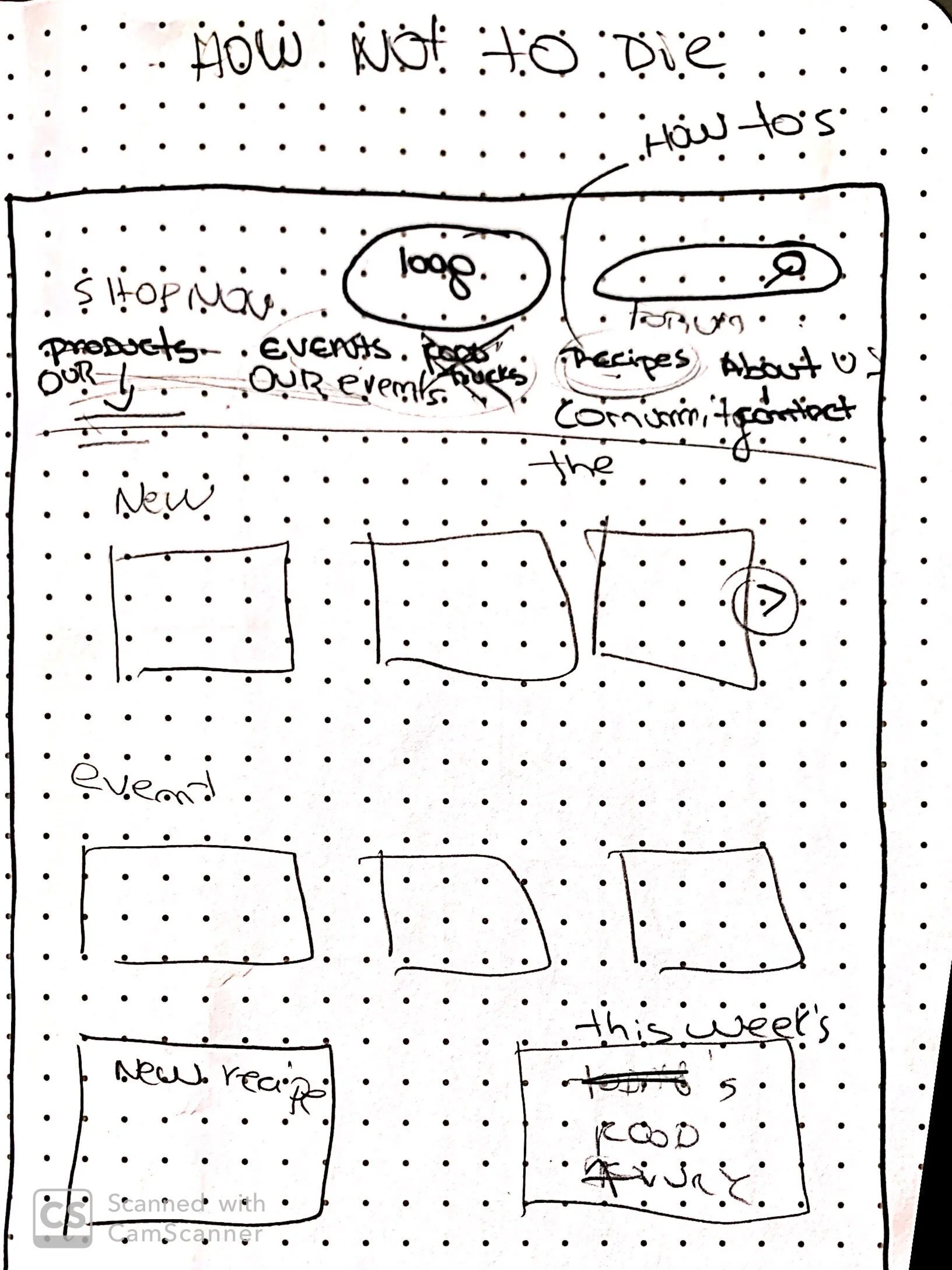
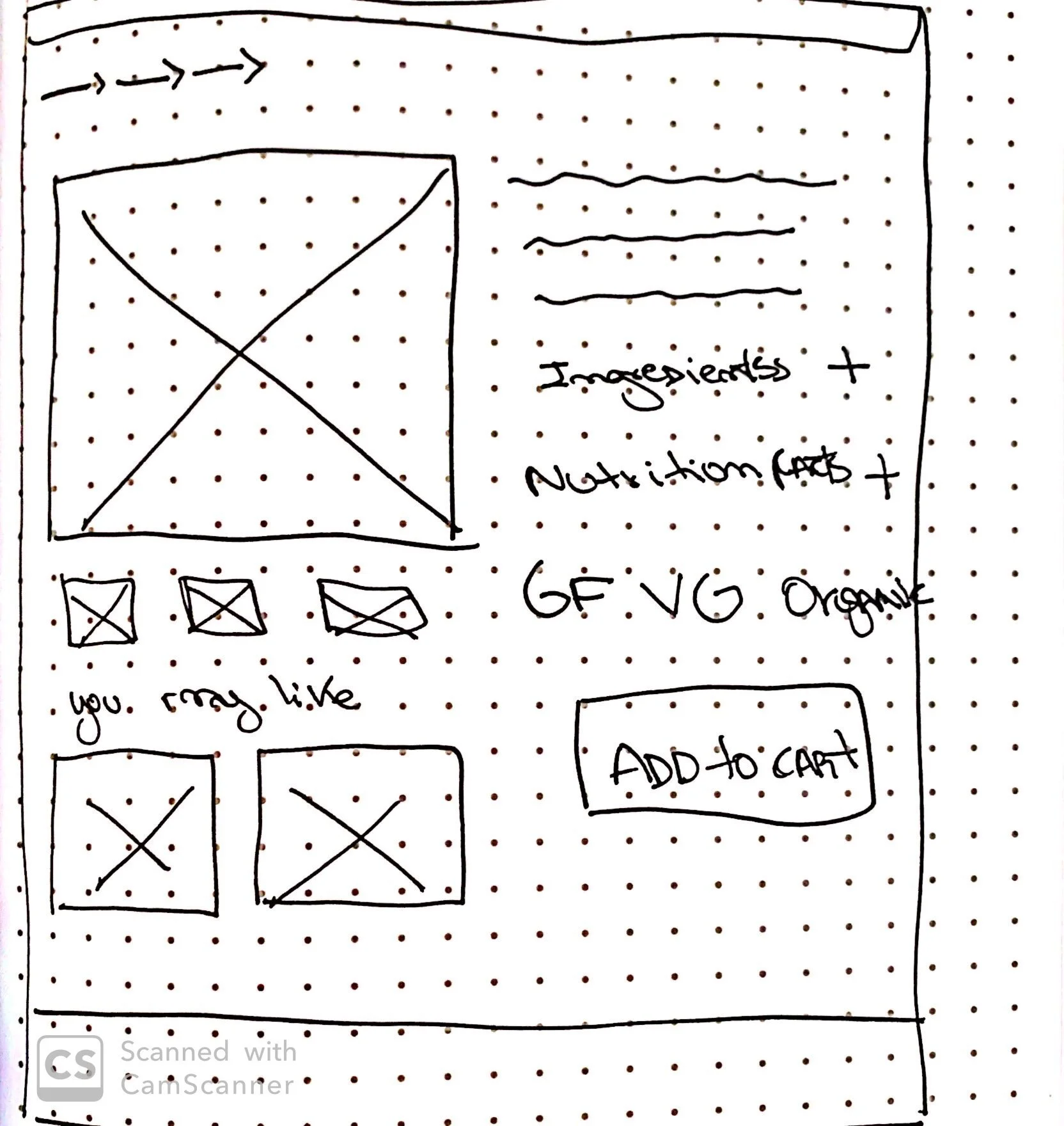
I had an idea in mind of what I wanted Nooch’s website to look like, but I wasn’t expecting to face as many challenges as I did. I first worked on my two user flows, which were clear and objective because of my persona’s goals. I first started sketching the home page, which will be the starting point for both user flows. The second page I sketched was the product screen since it was crucial to show all the dietary information on this page.
When sketching the home page, I faced a few challenges. Nooch offers an extensive list of products, which made it extremely difficult to organize the dropdown menu and the website’s architecture. I first focused on what was important to show on the menu bar. Based on the persona, I knew that events and community were one of the main goals.
Also, I needed to make the shopping experience easy without creating a frustrating user experience when trying to find a product. I worked on some card sorting and did a lot of competitive analysis so I could better understand how other grocery stores are organizing their categories.
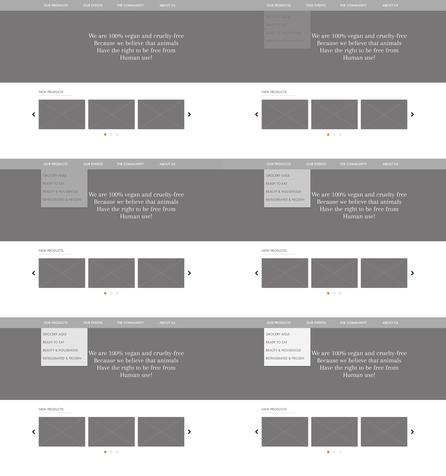
I finally decided to divide the menu bar into four sections: our products, our events, the community, about us. Under “our products”, I shortened it into only four main categories which turned out to be: grocery aisle, ready to eat, beauty & household, and refrigerated & frozen. Thanks to all the research, I was confident that I found the best solution for Nooch’s website information architecture.
Above is the home page wireframe, where it is easy to understand how the categories are divided. Also, the dropdown menu helps the user complete the task effortlessly.
Wireframes
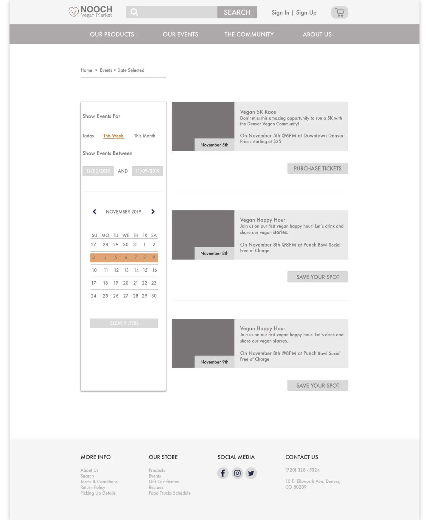
After initial sketches, I then started working on the website’s wireframes as previously shown. The biggest challenge was to keep the wireframes low fidelity since I found myself constantly fighting the urge to add pictures and colors. I wanted to stick to the grays and a simpler draft so I could deeply understand the user flow and my design thinking. For a better user experience, each persona had different user flows, which were both represented on the wireframes.
User Flow 1 - Shae, Dietary Restriction Persona
As for Shae’s user flow, the most important thing was to add a filter option to the website. That way, she will be able to filter the products that she is interested in based on her dietary restrictions. Also, on the product page it was crucial to display the product’s ingredients and nutrition facts which helped Shae verify if that specific product would fit her needs.
User Flow 2 - Luisa, Vegan Persona
In Luisa’s case, her main goals were to learn more about events and to have a normal shopping experience. Her user flow consisted of several screens, were one showed all the events hosted by Nooch, and the other screens had a normal checkout process so she could have a customary experience.
HI-Fidelity Prototypes
The second part of this project was to to turn the wireframes and lo-fi prototypes into higher fidelity screens. Additionally, the designed screens had to work as a responsive layout for both web and mobile. The goal was to not only improve the user interface through the previous wireframes, but to continue improving the design for a better experience. The choice of colors and pictures had the intent to deliver a clean and slick design. The main focus should be on all the products and services Nooch has to offer. This part was divided into the following steps:
Defining the brand color palette - The end goal was to tone that reminded the user of plants and earth. Secondly, the font choice was chosen to be clear and easy to understand - Assistant Regular, Bold, SemiBold, and Light. The second step was to improve Nooch’s logo and decide on the look and feel of the header and footer.
The third step was to gather all the content I needed, as well as displaying all images (products, events, news, and others). Finally, I started my design having in mind that I wanted a clean and effortless website. Meaning that the user can easily find all the information he/she needs without having to worry about an unorganized website.
Another crucial step was turning all screens into responsive layouts, which was better to first design for mobile because of the screen limitation. This way, it is possible to focus on what’s most important to be displayed based on the size. It makes it easier when moving from mobile to desktop because you can then add more content since the desktop size isn’t so limited.
Web Layout
Mobile Layout
Conclusion
This project reminded me of how much I love being a UX Designer. Every step of the way, whether it’s research or sketching, helped me understand the end-user better and also the company’s goals. One of the most important tools for this website to succeed was to have empathy for the consumer. Nooch is in such a niche market and it has so much potential to grow and reach different target audiences, not only vegans. The end result when compared to the market’s current website makes me astonished at all the changes that were made.
It would be extremely satisfying to see the changes I suggested being implemented. Also, if continued work had been done on this project, the next step would be to perform some user testability with real users. From those results, the data gathered should lead to more ideation and iterations. Finally, the design should be in a consumable state by the development team to begin implementation.


